12.19.2011

Rock That Chevron

Hot pink. It's a zesty, fun, unabashedly girly color. I used to hate pink pretty passionately but am now a completely different woman. It's very hard to explain. But today, I can appreciate a healthy dose of pink every now and then!

And TRY and tell me chevron isn't the best pattern ever these days! I was actually inspired by a super cute shirt at Old Navy I saw today when I was out Christmas shopping with my mom. It's on sale, by the way, so if you're into this kind of thing, you will only be about $7 poorer. Just sayin'.

In fact, it even looks cute in yellow...


Any who, hope you're getting everything done that you need to this Christmas season and are able to enjoy its true meaning at the same time! Maybe print out some thank you cards for your sweet friends and family for just being who they are. :)

- Lara

12.17.2011

Oh You Fancy, Huh?

Some people are fancy people. They are swirly, curly, diamonds & pearls, champagne, and roses... or at least they are on the inside. When it's up to them to throw a big bash, they order swan ice sculptures and set out the silky tablecloths.

Some people, on the other hand, are no-frills. They are straight lines, black & white, martinis, and minimalists. They are likelier to throw a downtown party with a lot less glitz and a lot more fashion in form. Still sophisticated, still modern, but a lot less concerned with being too romantic and flowery.

There are people whose wedding invitations will have silver ribbons and an Edwardian cursive writing, and there are people who aim to impress in a different way.

This design didn't begin today, actually. It is a variation on one that I made a couple of months ago for my boyfriend's birthday. I got a two photo frame and put a pic of us on the top and filled the bottom part with this design. It looks different from the following design in a few ways but that it an original and will not be duplicated. :)


If you know me, you might see a resemblance with these silhouettes... haha!

What a sexy font! To some it might seem plain, but to me, it is fresh. I think the faces and the heart are fun, especially if someone were to have the front of their invitations refer to scripture. It's a balance of a beautiful truth about what love is really founded on with a reminder that the wedding will be anything but grave. I am really liking it! I think I will save a few things for the future... hmmmm. :)

Well, Star Wars IV is beginning to get good again. (Thanks Spike TV!) Back to what I do best -- nerding out a little bit on my Saturday nights! Sweet dreams, friends!

- Lara

12.16.2011

Christmas Time Is Here!: Part Trois

Have I really nothing better to do?! Well, without any rambling, let me just get to Suite #2 of my Christmas cards...


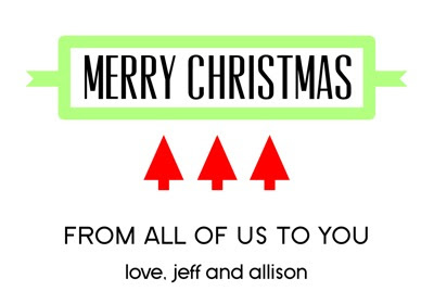
The first one looks like an ad almost, which is kind of why I like it so much. Lots of bright red and bold fonts. This is great for people who aren't about the swirly cursive cards, which can sometimes communicate mushiness or femininity I think. Plain and simple, and could even just be "virtual Christmas cards" one can post on a website, blog, or whatever is that one's little heart desires.

You might see me around here again today. But hopefully I will find something more important to do!

- Lara

Christmas Time Is Here!: Part Deux

Good morning friends! I am usually not up this early on Christmas break, but I have a sort of interview with Quicken Loans about interning or working for them next year. The guy sounded really relaxed and friendly so I think it will go pretty well! Then I might just go back to sleep, being the lazy bum that I am.

One of the reasons I sleep in so late is because I stay up so late. One of the reasons I stay up so late is that my body has been trained to do this because of homework and hanging out with my roommates not doing anything (one of our only common times of being home is midnight and beyond). One of the other reasons I don't go to bed so early is because my boyfriend tends to go hang out late and I like to talk to him on the phone while he's driving back home.

Yes, I have no life.

Anyways, in the time last night that I was not sleepy and having nothing important to accomplish, I started fiddling around with Christmas cards. Because I love the idea of sending them! I have never done it -- stamps are for rich people at this time in my life -- but someday, I would like to. And the nice thing is that I can just print them out and hand them to people or attach one to a gift. Either way, well, I just like Christmas and I like making things that look like Christmas.


Ahhh, Christmas ornaments. They're just so bright, shiny, and seem to shout, "I am Christmas in a little ball! Hang me on your tree or it will just not be right!" I played around with the same image in a couple of different ways last night. (It was also an excuse to use some of my favorite fonts ever. Drooly Mcdrools.)

I am seriously considering using the first one to put on things from me that I give out for Christmas... which I would need to buy first. Ugh. I also need to change the name on it. I like making up my fictional families, but someday they have to be from real people! That is my hope!

Well, here's hoping you get lots of rest this holiday season! I am about to...

- Lara

12.15.2011

A Winter's Tale

Well, yesterday, I was feeling very springy and sunshine-y. Like a bright bouncy daffodil. I was envisioning grass, flowers... in particular the smell of jasmine, which is my favorite thing about Florida springtime. It is just intoxicating!

But today, I am feeling much more wintry. On the real, I am tired of this weather. I would love to wear a jacket outside instead of shorts in December. Is that so much to ask, oh tropical peninsula? When will we have the slightest chance of lighting a fire in the fireplace without our faces melting off?!

Sometimes, when you can't get what you want, you have to pretend! (Within healthy reason, anyways. I am not saying you should forsake reality for delusional fantasy worlds.) Especially by making things that remind you that it's supposed to be winter.


Red, white, and black. It doesn't get much more classic than that. I really like white space when communicating winter and modernness. This is what I feel like Little Red Riding Hood would use on her stationery -- a little mysterious and dark but with a pretty, sexy pop of color. See, now who doesn't like fairy tales? Even if real winter isn't always that picturesque and lovely, it has its moments. Which I eagerly anticipate.

Stay dreamy!

- Lara

P.S. Many thanks to the efforts of the Graphics Fairy! She is responsible for this beautiful winter tree. I wish I could design things of that caliber. But for now, I appreciate what others provide for use. :)

12.14.2011

A Peep of Springtime

Hello! I am betting some people in this country are already counting down the days till spring. The weather is all over the board, some people snowed in every day, while we here in the Sunshine State are looking at high 70's every day. Maybe that's why I am still thinking in pretty, happy, bright colors. Yes, I love my burgundy nail polish and black scarves -- which a futile attempt at making it feel just a little more like Christmas-time to me -- but for some reason, today, I was thinking a lot about a very pretty bright fern color.

Very clean, modern, but definitely a little taste of springtime. :) The flourishes are a little less swirly and fancy, but fresh. Not 100% in love with the sans serif font and size yet... this is probably more of a prototype. See a trend with my love of ovals? (Observe the logo.)

Anyways, I hope your weather is treating you right and that you can love on whatever colors you want no matter the season!

- Lara

12.07.2011

Christmas Time Is Here!


Howdy, y'all! It is that time of year again... cold fronts, so that we Floridians are forced to get out our sweaters for once. Decorations hanging all over our apartment. Exams hanging over my head for me to ignore, thereby enabling me to keep procrastinating. Yes, it is all of those things. Must mean Christmas is on its way!

I really can't even believe it's already December 7th. A whole week of December? Gone? What on earth is going on around here! 2011 flew by so fast that it's just silly. So many things have happened. A year ago, I never imagined that I would be spending my next Christmas in a place that is a bit much colder than it is here.

That cold place being Detroit.

With a boy. (Nah... man.)

Who I am in a relationship with.

And am spending the holidays with.

Along with 1273981723 other members of his family.


SO EXCITED!

I am too much in the Christmas spirit for studying for tests. I am beyond tempted to put A Christmas Story in the DVD player versus writing notes for all the essay questions that can appear on my final exam tomorrow. My final final exam. Praise the Lord.

No, really, praise Him for all He has done!


This truth is so very easy to forget. He came and was born among humans to suffer every day of His life as we do, in order to be crucified for our sins, and then come back to life, trumping death and revealing to us our glorious future in Him! How incredible that really is! I am not sure what this graphic is intended for, but I was inspired by the gravity of this verse along with it being Christmas-y indeed. Perhaps to frame on the wall in December as a reminder of why we celebrate this holiday in the first place.

I think red, gold, and silver are my favorite Christmas colors. One day, my house will have to be color coordinated to all fit into the same scheme... the idea of everything looking random and different will drive me crazy! It could last until I have some little kid handmade decorations to put up. Hmm, let's hope that is far away because the thought of that is kind of scary. Haha!

Anyways, meditate on the beauty of Christ's birth and life this holiday season! Oh, and study for your exams. They will be over so very soon. Have fun drinking hot chocolate and singing some carols!

- Lara

11.07.2011

Melon-licious

Good afternoon, y'all! Life has been busy like a bee for me, lately. I can't believe my last fall semester is winding down already... in two weeks I will be driving home for my Thanksgiving holiday! My boo is coming down to hang with my family that whole week, which I am a little more than pumped about. :o) (Clown nose smiley face is so cute!)

In between writing research papers, doing odd jobs of the campus ministry variety, and the other things going on in these parts, I still like fiddling around on the computer in my spare time. Because I can't do something normal like read a book or watch a movie, I guess.


Maybe the pretty melon color and neutral gray combo will go out of style soon, I don't know, but at the moment I think it's just lovely! I am a little unsure of the font combination at this moment but for now, I feel like this is cute. This kind of style would suit a chic springtime feel for sure.

Anyways, there is not much to say today. I hope your Monday started off the week as good as a Monday can!

- Lara

10.31.2011

It's Ombre, Hombre

It seems Mondays are my day to put things up, just for fun. I have really been liking the ombre trend that has been circulating all over the place. Cake tiers, stripes on cloth, and even hair... everything is ombre these days! I don't know that it's that brand new, but either way, I wanted to put my own spin on it.


These dusty fall colors are all the rage these days, too. Is it gray? Is it purple? I like to think it's both! :)

I think people finally got excited about paint chips sitting around at Lowe's and Home Depot and decided to put their majesty to good use in their crafts, art, and designs. I remember covering a notebook with paint chips in middle school. It's addictive. I made a picture frame using them as well. It has nothing in it yet and isn't hanging up, but I am waiting for the right thing and the right place to become evident to me. Until then, I'll be making more ombre magic happen elsewhere!

Have a delightful evening!

- Lara

P.S. Duhhh, it's Halloween! Totally forgot. Goes to show how spirited I am, and how I don't live somewhere where children are likely to show up at my doorstep, haha. Happy Halloween! I'll see you tomorrow in line at Target with my twelve bags of half-off candy. :)

Up With The Times

Hello, everyone! (Every... no one, haha. That is totally fine by me.) Even if I am writing to an essentially pretend audience, I am practicing what it is like to write to real readers and connoisseurs of all things eye-catching and clean, when it comes to design.

I really like things that are simple and have the right balance of colors, straight lines and curves, and have a really sharp, polished look. All the weird neon gradiation and moving GIF graphics of the past? It just doesn't look 2012. Using only typefaces that come with MS Office 2000? People's eyes tend to glaze right over those things. My hope is that if I ever get to put my brain to good use for someone else, I can come up with something that is attractive enough to pull in the right people's attention and convince them that they can expect professionalism in every way. Up-to-date use of our social media and communication. Good organization. Good communication. This generation wants everything available and answered at their fingertips and will move on to someone else who does that if the first company/firm doesn't fit that bill -- and if they haven't touched their website since 1995.

This all has nothing to do with what I am putting up today at all, really! I just wish I could help out some of the businesses I see online or around town without someone really putting time & effort into their advertising. So much potential!

Anyways, this was a quick and not-so-exciting little flyer, but I think it looks pretty and sophisticated enough:

There isn't really that much crazy stuff going on here, two fonts and two colors (besides black). But simplicity does the trick! I love that I get the chance to make up invites and flyers for Cru at my university and can play around even more on my software and see what I am capable of and get better and better.

Here's to modern aesthetics! (At least, what I think is modern-ish. It's okay to have a different idea!)

- Lara

10.24.2011

Save the Date #2: A Little Bit of Curl

I lied. I flagrantly lied. I'm just on a roll, and there's no stopping me! Thank you, professors, for giving me a week of from some paper being due. :) I appreciate it! It lets me get my juices flowing and play with some colors!

When you find a gorgeous font, you look for ways to use it and make it work. It is just too pretty to leave lying on an invisible shelf inside of your computer. What, you didn't know that's how computers are organized beneath all that plastic??

This is one such case. It was too swirly and perfect. It needed some air. It needed life, people. I admire typeface artists so much for somehow creating these masterpieces that we take for granted, as if there was a "big bang" creation of all the fonts in the world. Someone designed that Verdana you use all the time, or cute little Trebuchet. Even Arial! (That guy must have made BANK.) Next time you are like, "Wow, those letters look cool," when you're looking at a magazine or an invitation, appreciate the person who made it! They do good work!

Anyways, that was kind of irrelevant.

See what I mean?! You know exactly which line of text I am talking about. Mmmm. So delightfully full of swoops and curves. Yes, my beauty, you had to come out and strut your stuff somewhere. Even if it is an imaginary Save the Date card. Maybe someday, I will have the chance to print you on paper -- what a glorious day that will be!

Keep it classy, friends!

- Lara

Bible Study Flyer

I promise this will be my last update for the day. I realize I could have combined all of these into one massive post, but that makes me look less accomplished and more like I have no life. (I DO HAVE ONE!)

Or maybe the choice is giving me the opposite PR problem? Eh, whatever.

I made this earlier today to print and hand out on campus to invite students to the community group bible study I co-lead. I hope it isn't too feminine? I have a hard time occasionally gauging color and style to keep something from being girly but also giving it a little pizazz, so that everything you get isn't just Times New Roman boring.

Would you be likelier to check something out if it looked like time was put into the ad you are handed, or the commercial you watch? Or if the style looks current with the times? Why do you think that has such an impact on people's decision-making? It's fascinating to me that something cheap, boring, or out-of-date can quickly turn someone off of something that they really might be into. Either way, it's just an interesting thing of culture and psychology. Who knows. Thanks, popular media!

- Lara

Experiment #1: Save the Date

So, as I have already mentioned, I am not a professional graphic designer. I haven't taken one class at my university (since they are only offered at the other campus), except for a little "don't you wish you could afford this!" session Adobe put on for their Creative Suite 5.5. My disclaimer is that I will not pretend to be super good at any of it. I just think it's fun and sometimes I feel like what I make turns out okay. :)

I am turning into such a girly-girl these days. Growing up, I avoided pink as much as possible. I was very selective about frills and bows that appeared on my person at any given time. As a teen, I prided myself a lot more on my excellence in school than I did in doing my makeup or flirting with boys, although on the inside, I secretly wanted to be into those kinds of things but was just too concerned with being taken seriously. But when I started to follow Christ (read about it here!), I was a lot more comfortable in my own skin and began to let the real me come out and play. I felt the freedom to bake cupcakes and wear glittery eyeshadow! Because it didn't matter to me as much anymore that people look at me and be impressed by how smart or talented I was, I sure had a lot more fun being the girl that God made me to be!

All of that is to say that now, out of seemingly nowhere, I am really having more fun with wedding stuff. Part of it probably has to do with the fact that I am finally in a serious relationship with the most AWESOME man in the history of the world, Darin, who I could talk about for hours if I wasn't overly conscious of sounding like that girl. (You know what kind of girl I am talking about.) Now, wedding things just don't seem that unrealistic and far-off anymore, and there is so much fun to be had when a couple has a chance to let their personalities show off!

This is my very first try at a fancy "save the date" card. And by fancy, I mean not-too-fancy; it has a pretty modern feel and nice summer colors. It's more along the lines of what I would pick if I were planning a wedding... which isn't looking too far off, so I'm not a psycho yet, right? ;)


I just adore lemony yellow! It's a happy, laid-back color that says, "You can relax and have a good time at this wedding. Bridesmaids, your dresses will not be expensive. Enjoy your mojitos during the reception." Not that there's anything wrong with super classy, fancy weddings, but for some people, they like the simplicity of keeping it in a "yellow" state of mind.

Anyways, friends, have a fresh and fun day, and be true to yourself!

- Lara

The Start of Something New

I hope the title of this post doesn't get High School Musical stuck in your head! That only occurred to me after the thought. Well, either way, I think it best communicates what's going on with this site.

I am not new to writing or sharing on the internet -- I have a couple of projects (mostly for my own enjoyment) going on already, although admittedly I haven't been so active in updating anyone on my life via these outlets lately. My philosophical/spiritual/Jesus-related musings are found at In Due Time, My Child and some fun adventures in cooking, traveling, and other ideas in collaboration with one of my dearest friends is going on at Jabuka, Jagoda, Breskva. (That means "apple, strawberry, peach" in Bosanski, in case you were wondering. The title makes sense if you read!)

But this site is brand spankin' new not only to my family of unread blogs, as well as to me in general. I confess that I am a little nuts about design now. Mostly in a spectatorial fashion rather than as an artist. It drives me nuts seeing really outdated, ugly logos or signs that use Papyrus, or... Comic Sans. Ugh, I just shuddered writing that. I am kind of snobby about it sometimes. But on the bright side, I really admire other people's beautiful designs for everything else. A perfect typeface, a good color scheme, an amazingly drawn and colored graphic, can each draw you in and give some personality!

Upon experimenting with some programs available to me, I happened to discover that I really like playing around with design myself! I am definitely in the practice stages, learning a lot about what I can do and how to make it happen. I don't think I have the chops to build my own business or a school portfolio or anything, but I'm liking doing this in my spare time, and so this is where I'm going to poop out my ideas so they are all in one place. I hope that every time things will look better and better! :)

So, if you like what you see, thanks for noticing! If by some weird miracle anyone would ever like me to adapt something I am playing around with to be used in real life, I'd be happy to oblige, just shoot me an email at lara.l.dickerson@gmail.com.

If you are one of the three people that will probably ever read this blog, thank you for your eyes and have a blessed day!

- Lara